As the year goes on and I have more and more Yearbook pages to work on, I’m realizing the sheer amount of effort and skills that go into making a page. If I were to advise someone now on how to make a great yearbook page, this is what I would say:
1. Borders and Spacing
When you’re making a great Yearbook page, this may be the last thing you want to think about, but I have realized how important it is. You should always use the alignment tools to get the spacing right, which is something I’m working on with all my pages
2. Print out a sample page
It’s really important to make sure you are working with CMYK colors and not RGB colors, and this is something you can make sure of by printing a draft page. It’s better to realize the red you used actually shows up as brown on paper while you’re still working things out, as opposed to when you’re getting your page signed.
Picture size is also something you might change your mind about when you see how big or small it actually is on paper, so its a good idea to get a feel for how big pictures are on the paper versus the screen.
3. Layout the pages as it would be on the Yearbook
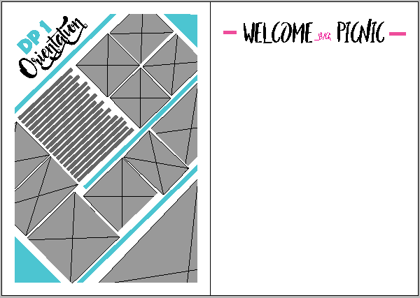
After designing great pages, the last thing you want to discover is that the pages that go next to each other don’t mesh at all. So when designing single pages, its always better to design the left and right pages together in one document.
4. Show it to more experienced Yearbook members
For me, this really helped because they usually spotted a lot of technical aspects (like the spacing) that I hadn’t thought of. Also, whenever you can’t get a picture exactly the right size, or in exactly the right position, they are always there to tell you you’ll get the hang of it!
